Overview
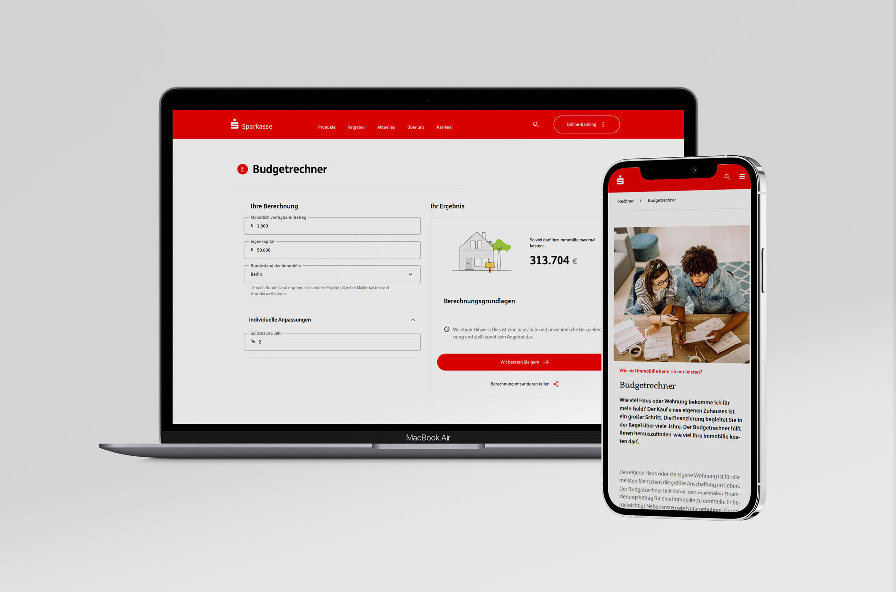
The Budget Calculator (Budgetrechner) is a key entry point for users exploring property financing options. Its purpose is to help prospective buyers estimate how much property they can afford. Despite attracting relevant traffic, the experience was difficult to understand, contained confusing inputs, and did not guide users effectively toward the next step in their financing journey.
Explore the live productChallenge
Analytics and business data indicated low conversion and engagement rates. A UX audit revealed several sources of friction: complex financial terminology, unnecessary input fields, unclear results, and calls-to-action that did not match user expectations.
The calculator focused on financing details that were meaningful to experts, while users primarily wanted a simple answer to the question: ‘How much house can I afford?’
Goal
- Simplify the calculator experience and reduce cognitive load.
- Increase trust through clearer and more transparent results.
- Improve discoverability and guide users to relevant next steps.
- Increase conversion and lead rates.
My Role & Responsibilities
UX Audit & Current-State Analysis
Conducted a UX audit of the existing experience and analyzed user journeys to identify key pain points, friction areas, and drop-off moments in the flow.
Benchmarking & Competitive Analysis
Conducted a competitive analysis of similar financial tools to understand how others handle complexity and guide users toward a decision.
Wireframing & Prototyping
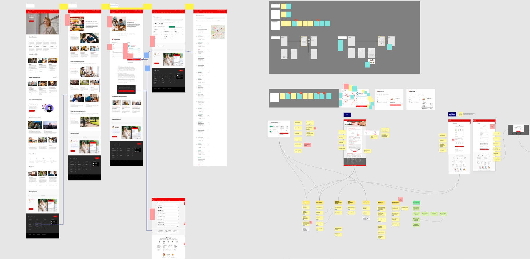
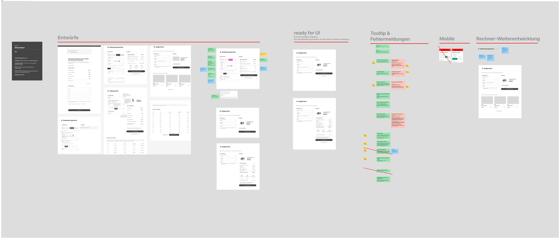
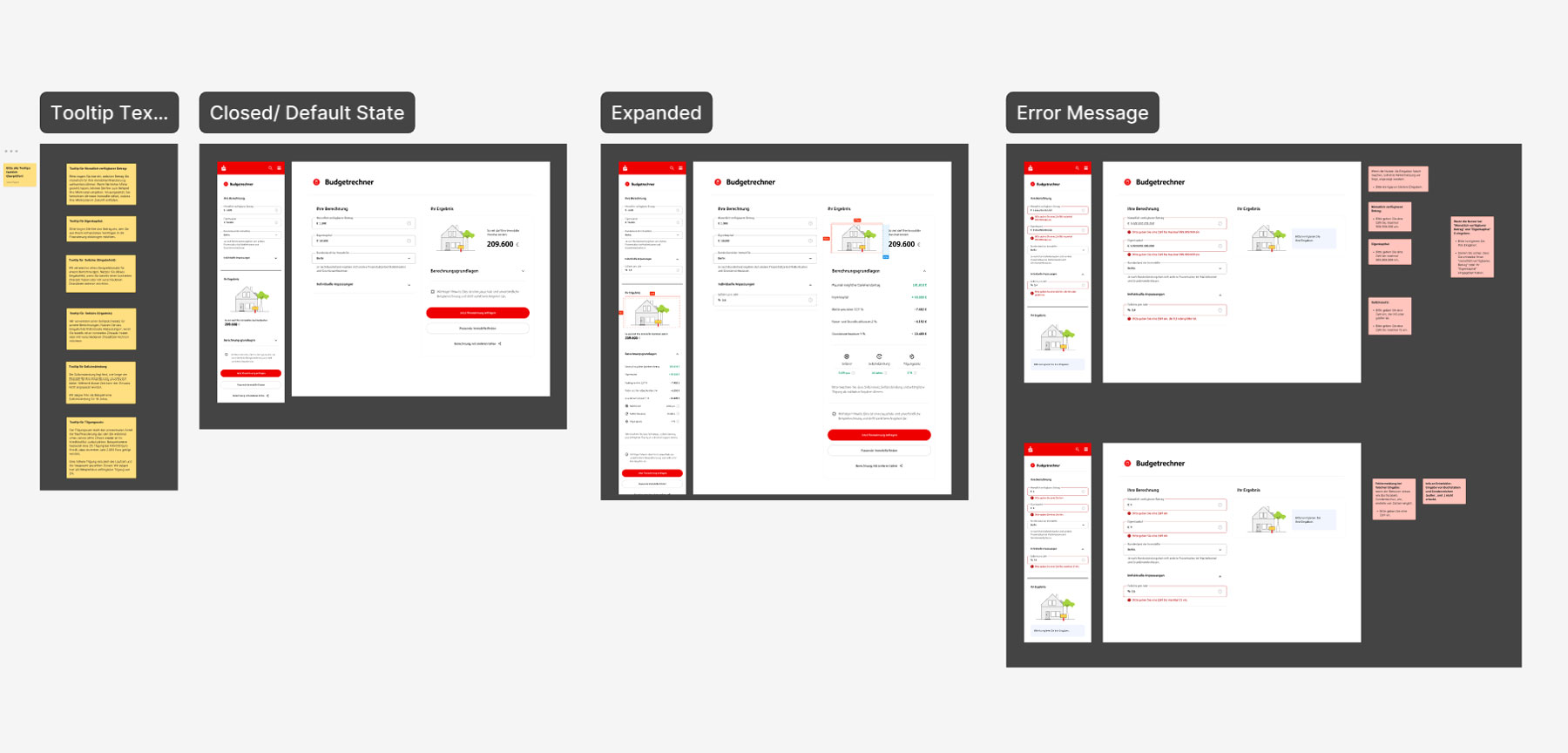
Designed iteratively from sketches and low-fidelity wireframes through to polished, developer-ready high-fidelity prototypes.
Stakeholder Workshops & Collaboration
Worked in agile sprints with design reviews, stakeholder workshops, and close collaboration with developers and financial domain experts throughout implementation.
Process
We worked in an iterative agile process, refining the budget calculator step by step through daily stand-ups, design reviews, and continuous stakeholder feedback. Each sprint focused on improving the experience, validating assumptions, and turning feedback into practical design decisions.
Discover → Design → Build → Deliver → Measure
To understand the opportunity, I conducted a UX audit of the existing experience and benchmarked comparable financial calculators. I analyzed the current user flow, identified usability issues, reviewed content and navigation patterns, and mapped opportunities to better align user needs with business goals. Together with the project team, we prioritized improvements and defined a scalable routing strategy that could be adopted across multiple banking institutions.
Key Findings
- Important fields such as interest rate and repayment rate were difficult for users to understand.
- Some inputs were redundant and could be calculated automatically.
- The primary result focused on financing amounts rather than property affordability.
- Users lacked transparency about how results were calculated.
- Navigation and follow-up actions were not aligned with user intent.
Based on the findings, I developed a concept focused on clarity, guidance, and trust. I collaborated closely with designers, developers, and financial experts to ensure technical feasibility and accuracy.
Key improvements included:
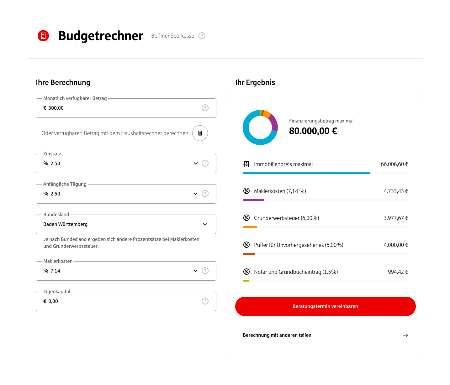
- Simplified inputs and clearer labels.
- Automatic calculation of values that users should not manually provide.
- Improved error handling and contextual guidance.
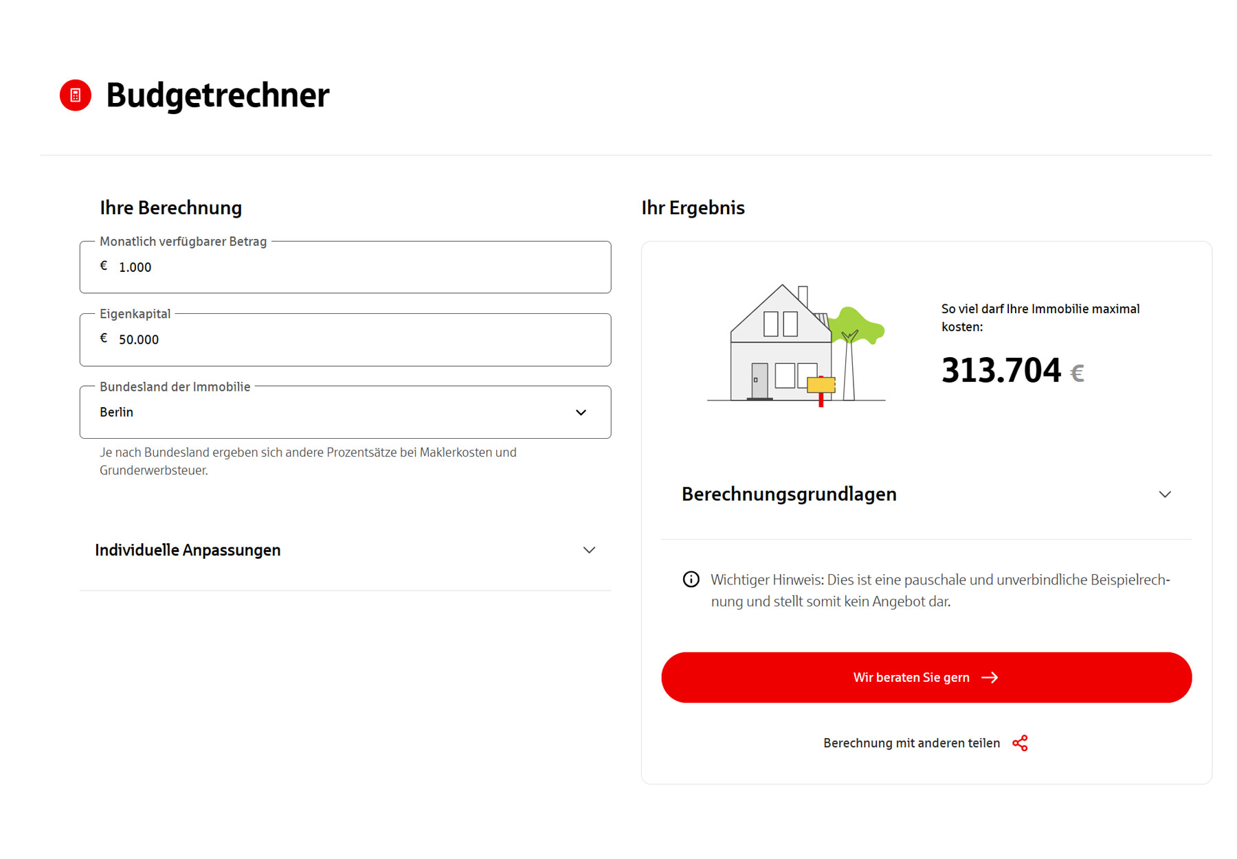
- A redesigned results area focused on maximum affordable property price.
- Transparent display of assumptions and calculation details.
- Stronger visual hierarchy and progressive disclosure.
- More relevant and action-oriented calls-to-action.
- Improved routing to related financing services and content.
I translated the selected concept into high-fidelity designs and refined interactions, documented edge cases, and worked closely with developers and domain experts throughout implementation. Regular review sessions ensured alignment with stakeholders and allowed the team to iteratively improve the experience before handoff.
Final Prototypes
Measure & Impact
The redesigned calculator reduces complexity and makes it immediately clear how much property users can afford, which lowers cognitive effort and the risk of input errors. By presenting a focused result (“So viel darf Ihre Immobilie maximal kosten”) together with a clear consultation call‑to‑action, the experience better supports completing the calculation and encourages users to move from self‑assessment to advice.
This setup is intended to improve two key outcomes: a higher share of users who finish the calculation, and more users who proceed from the result view to requesting consultation. While post‑launch analytics were not available to me, the design explicitly targets these behaviors and provides a clearer basis for tracking calculator completion, time to completion, and clicks on the consultation button in future iterations.